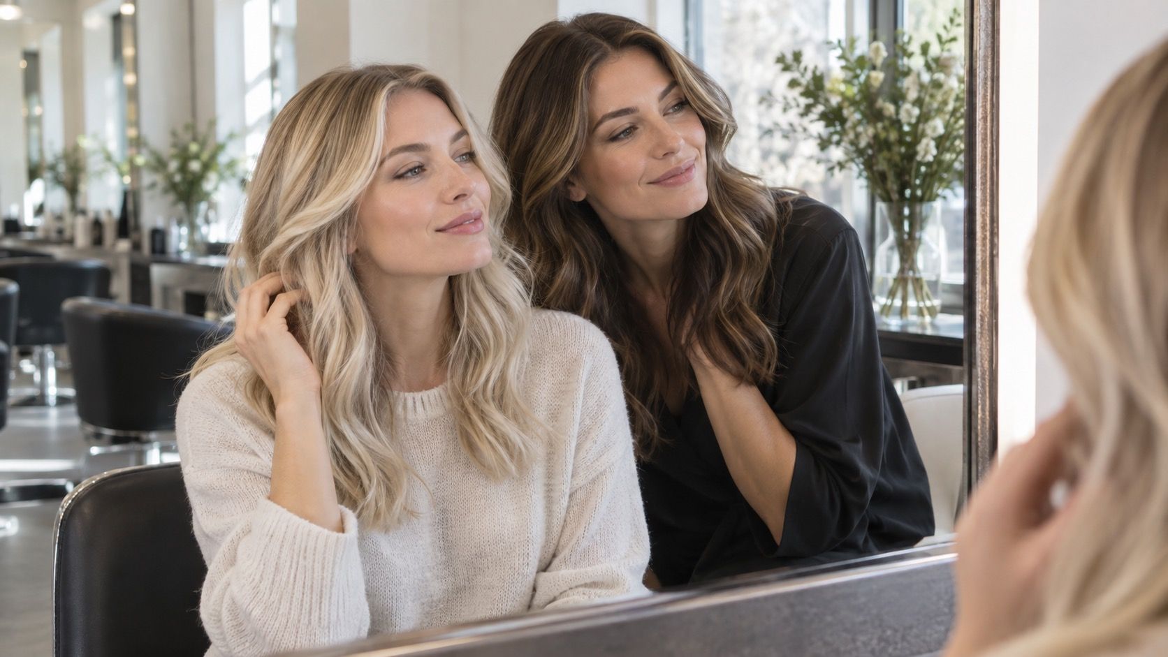
A virtual hair color try-on is most useful when it narrows a crowded salon inspiration folder into two or three realistic directions. It is less useful when it turns one flattering screen image into a promise. The difference comes down to the question you ask, the photo you use, and a few unglamorous features that make comparison easier.
Start with the decision you need the preview to make
Before opening a hair color simulator, decide whether you are choosing a color family, a depth, or a dramatic change. Those are separate decisions. Someone with medium brown hair who wonders about warm caramel versus cool ash is comparing temperature. Someone considering black, espresso, and deep chestnut is comparing depth. A preview can be very good at showing the first impression of either choice; it is not equally good at predicting the finished formula.
That distinction saved me from the familiar late-night trap of testing twenty tiny shade swatches and learning nothing. Pick a short question instead: would a copper-brown make my skin look clearer than a neutral brown? Would a soft blonde remove too much contrast from my brows? With one question in mind, even a simple hair color try on becomes a useful filter rather than a digital dressing-up game.
For a salon appointment, bring the two or three previews that answer that question and a current photo in daylight. For at-home color, use the preview to reject clearly wrong directions first, then read the actual shade chart and starting-color instructions. The screen result belongs at the beginning of the decision, not at the checkout.
Look for a clean outline around the hair, not a dramatic effect
The most helpful feature is often the least exciting: decent edge handling. A good preview follows the hairline around the forehead, ears, and parting without painting over skin or leaving a hard helmet-shaped border. Zoom in before judging a shade. If the filter has blurred the temples, swallowed wispy fringe, or covered the earring line, it may also be inventing depth where your real hair is fine and translucent.
Blend controls matter for the same reason. Real hair rarely changes as one flat sheet of color. Roots are usually deeper, ends may be porous or sun-lightened, and the area near the face catches more light. A tool that lets you soften the edges or reduce the effect can be more informative than one that offers fifty fashionable names. I trust a quiet, slightly imperfect preview more than a glossy result with a painted-on shine stripe.
Check the parting separately. It is where natural root color, scalp contrast, and regrowth will be most visible in everyday life. If a very light blonde looks lovely only because the simulator erased that contrast, note the limitation. A stylist can create a shadow root; an app cannot tell you whether it is the maintenance level you want.
Use shade families and depth controls to make side-by-side choices
A long shade selector is useful only when it is organized into understandable groups. Start with four families: warm, cool, neutral, and vivid. Then compare one level lighter and one level darker within the family that feels closest. This makes the result legible. A honey blonde, beige blonde, and mushroom blonde may look like unrelated labels at first, but they answer a clear question about warmth and contrast when viewed together.
Depth is especially easy to misread on a bright phone screen. Turn the display brightness down a little, then view the same comparison against a plain background. A shade that seems like a modest change on a white app screen can read almost black beside a cream sweater or in a dim hallway mirror. Save a three-image set: current hair, the most natural option, and the option one step bolder. It gives you a useful reference later, when the excitement of the filter has faded.
| If you are deciding... | Compare this first | Useful preview check |
|---|---|---|
| Warm or cool | Two shades at the same depth | Look at cheeks, under-eyes, and brows |
| How light to go | One, two, and three levels lighter | Check the parting and face-framing pieces |
| Whether to go darker | Current color beside two deeper neutrals | Check whether facial contrast still feels natural |
| Whether a vivid color suits you | Muted and saturated versions of one hue | View it in ordinary room light, not only on-screen |
Choose a still photo when live camera keeps changing its mind
Live camera try-on feels immediate, but it can be the worse option for a careful choice. Phone cameras continually adjust exposure and white balance. Move from a window to a warm kitchen bulb and the same simulated brown may swing from ash to copper before you have changed a single setting. It is entertaining for a quick idea; it is not ideal when you are choosing between close shades.
An upload tool gives you a slower, more repeatable comparison. Use a recent, unfiltered portrait facing a window in indirect daylight. Keep your hair down, take off tinted glasses, and avoid portrait mode if it has blurred the outline around your head. Then use that same photo for every shade. A preview is easier to compare when the camera, angle, expression, and lighting are not changing underneath it.
There is one exception: live camera can reveal whether you personally enjoy seeing a bold color move with your face. A burgundy or bright copper may look surprisingly natural in a static image yet feel too loud once you see it beside your clothes and expressions. Treat that reaction as valuable taste information, not as a measurement of exact color.
Keep a shade history so memory does not choose for you
After six or seven previews, memory becomes unreliable. The last shade often seems best simply because it is still on the screen. The best virtual hair color try on experience lets you save favorites or compare them in a grid. If it does not, take screenshots and name them by family and depth: neutral medium brown, cool dark blonde, warm copper brown. Avoid names like final or maybe; they only add confusion when you return a week later.
Review the saved images the next day on a larger screen if possible. Check them in daylight and in one ordinary indoor setting. Ask a narrow question each time: does this shade overpower my features, make my natural brows look disconnected, or require roots to be hidden every few weeks? These checks are more practical than asking which image is prettiest in isolation.
It also helps to include your current shade in every set. Without that control image, a simulator can make an ordinary change look urgent. Sometimes the useful outcome is simply confirming that your existing color already fits your skin tone, and that a gloss, toner, or a few face-framing pieces would satisfy the itch for change.
Use privacy and editing controls before you upload a portrait
A photo preview requires a face image, so take a minute to inspect the basics. Look for a clear delete option, whether images are stored in an account, and whether you can use the tool without connecting a social profile. If the settings are vague, crop the photo to head and shoulders and avoid using a picture that includes children, an address, a work badge, or a recognizable location.
Editing controls deserve the same scrutiny. A filter that also smooths skin, whitens teeth, reshapes the face, or adds makeup changes the context in which you judge hair color. Turn those extras off. Hair color is already affected by skin tone, lip color, and contrast; adding a beauty effect makes it impossible to know whether you like the shade or the edited version of yourself.
Know what a simulator cannot settle before you buy color
A hair color simulator cannot inspect previous dye, bleach, henna, mineral buildup, porosity, or gray coverage. It cannot see whether your ends will grab toner more strongly than your roots, and it cannot calculate the developer or lifting process needed to reach a previewed blonde. Those are chemistry and hair-history questions, not failures of the tool.
Use the preview to arrive at a better conversation: I prefer a neutral medium brunette over a golden one; I like copper only when it stays brown enough at the root; I want brightness around the face but do not want a full-blonde maintenance cycle. That is specific enough for a stylist to translate into a plan, and cautious enough to prevent an app image from becoming an unrealistic instruction.
The best result is not a perfect digital recolor. It is a short list of shades you can explain, a photo taken in honest light, and a clear sense of which compromise you are willing to make: warmth, contrast, upkeep, or the risk of a bigger change.