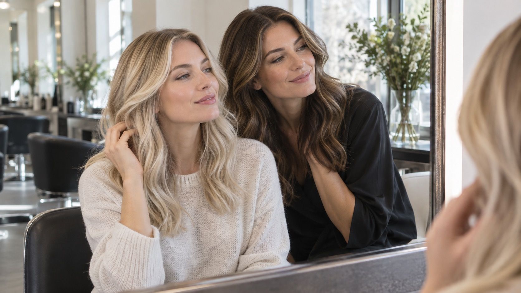
A hair colour filter can be an excellent way to rule out an idea before a salon visit or a box-color purchase, but it can also make a perfectly plausible shade look absurd. Usually the color is not the real problem. The photo, light, screen, and comparison method have quietly changed the evidence, so the preview is answering a question you did not mean to ask.
Do not start with the most flattering selfie in your camera roll
The familiar selfie taken at golden hour, with a smooth-skin filter and a carefully chosen angle, is a bad place to judge a new hair color. It has already been edited by warm light, automatic exposure, and often a little face retouching. Add a simulated caramel brown or strawberry blonde and the result may look wonderfully expensive, while the same shade would feel much stronger in a normal bathroom mirror.
Use a recent photo taken facing a window in indirect daylight. Stand about an arm's length from the camera, keep both sides of your hair visible, and make sure your forehead, temples, and parting are not hidden. This is not about producing an unflattering passport photo. It is about giving the virtual hair color try on a clean outline and a neutral starting point. A plain top and a simple wall help because a bright red collar or patterned background can make warm and cool shades appear to change.
Turn off portrait blur, beauty mode, teeth whitening, and makeup effects if your phone applies them by default. A berry lip color and softened under-eye area can make a cool brunette seem more harmonious than it really is. The preview should show whether the hair works with your everyday face, not with a collection of quiet edits layered on top of it.
Let daylight test the shade, not a warm kitchen bulb
Indoor lighting is one of the quickest ways to reject a shade for the wrong reason. A warm pendant bulb can push ash blonde toward beige, make neutral brown look chestnut, and turn a soft copper into something almost orange. Cool office lighting has the opposite habit: it drains warmth from golden blondes and can make a healthy medium brown look gray. Neither setting is useless, but neither should choose the shade alone.
Make one comparison in indirect window light, then revisit the same saved screenshots in an ordinary indoor room. The useful question is not, “Which one wins under this lamp?” Ask whether the option still looks believable in both places. Hair is seen at a desk, in a car, in a supermarket, and beside a bathroom mirror; a color that only succeeds in one flattering pool of light is not necessarily a bad color, but it is a more demanding one.
Watch the white balance too. On a live camera, a phone constantly adjusts the whole image as you move. You may think a hair color simulator changed a shade from cool to warm when the camera simply recalibrated against a cream wall or a dark curtain. A still uploaded photo is slower but more reliable for close decisions. If you use live mode, stay in one spot and compare screenshots rather than trusting the moving image.
| Preview problem | What it can falsely suggest | Practical correction |
|---|---|---|
| Warm indoor bulb | Cool shades look dull or muddy | Save the result and compare it in indirect daylight |
| Overexposed window selfie | Every blonde looks lighter and smoother | Move out of direct sun and keep detail in the roots |
| Phone at maximum brightness | Dark shades seem flatter than they are | Lower brightness slightly and check a second screen |
| Beauty filter | Skin changes make the hair seem more flattering | Disable retouching before trying any color family |
Keep your natural root in the picture
A filter often paints color through the whole head with the enthusiasm of a fresh wig. That can be fun for testing a dramatic direction, but it hides the first practical issue you will notice after coloring: the relationship between your natural root, scalp, brows, and new length. A light beige blonde may look polished when the preview erases the root. On your actual hair, it may require a shadow root, a soft blend, or more frequent maintenance than you expected.
Zoom in on the parting and hairline before you decide a shade looks wrong. If the simulator has covered the scalp, blurred baby hairs, or made the root exactly match the ends, treat the image as a color mood rather than a finished result. A better question is whether you like the overall depth and temperature next to your features. The exact transition is a separate choice, especially if you have previous highlights, gray hair, or naturally dark regrowth.
This matters in the other direction as well. A deep espresso preview can look severe because the tool has filled every lighter piece around your face with one opaque dark block. In real life, a stylist might retain subtle dimension or choose a neutral brown that reads softer outside. If the shade family appeals but the preview looks helmet-like, reduce the opacity if that control exists, or compare a version one level lighter before dismissing it.
Compare close options before trying the extremes
Many people open a hair color try on tool and jump from platinum blonde to blue-black to vivid copper. There is nothing wrong with enjoying that experiment, but it rarely answers the decision that comes next. Most salon and at-home choices are made between neighboring shades: neutral dark blonde versus cool dark blonde, warm medium brown versus copper brown, or soft black versus espresso. Those differences are harder to see and more useful to save.
Start with your current depth, then test one shade lighter, one shade darker, and two temperature versions at the same depth. Four images are enough for a sensible first round. Put them beside the original photo and look for three things: whether your brows still make sense with the hair, whether your skin looks clearer or more shadowed, and whether the contrast feels like you. It is a calmer process than chasing the most dramatic transformation, and it produces a clearer reference for a colorist.
Saturation deserves its own comparison. A rich copper and a muted auburn can share a general hue while creating very different first impressions. The same is true of inky black and soft blue-black, or honey blonde and subdued golden beige. If a color feels “too much” in a hair colour filter, try a less saturated cousin before concluding that the whole family is not for you. Often it is intensity, not warmth or depth, that causes the uneasy reaction.
Do not let screen brightness choose your level of contrast
A phone screen is built to make images look vivid, especially when brightness is high in a dark room. This creates a small but persistent trap with dark hair colors: chocolate, espresso, and black can all collapse into one glossy mass. On the same screen, blonde highlights may look brighter and more evenly blended than they would against your real skin in daylight. The preview has not necessarily failed; the display has become part of the filter.
Lower screen brightness to a comfortable middle setting and look at the saved previews again. If you have a laptop or tablet nearby, view the same images there as a second opinion. You are not searching for laboratory accuracy. You are looking for choices that remain understandable when the device is no longer flattering them. A dark color that still shows some softness at medium brightness is easier to judge than one that only looks good as a shiny black silhouette.
Also check the preview at its actual size. Zooming into a face can make tiny issues around the ear or hairline seem decisive, while viewing only a thumbnail can hide that the total contrast is too strong. Look once at a normal portrait size, once at the whole head and shoulders, and once at the parting. Each view catches a different kind of mistake: overall balance, silhouette, and root realism.
Know when the preview has done enough work
A virtual preview is good enough when it reduces uncertainty, not when it produces a photo you want to frame. Stop after you have a short list of two or three directions that still look reasonable in honest light: perhaps neutral medium brown, muted copper brown, and dark beige blonde. Save those images with simple names, plus the original photo, so you can review them the next day without relying on the excitement of the moment.
There are questions a hair color simulator cannot settle. It cannot read the porosity of bleached ends, predict how old dye will lift, calculate gray coverage, or tell you how a toner will fade after several washes. It cannot know whether you will enjoy maintaining a bright root every four weeks. Those are hair-history and upkeep questions, best answered with a stylist or with the instructions for the specific at-home formula.
Use the preview as a way to speak more clearly about what you want. Instead of presenting one edited image as an order, you can say that you prefer a cooler result to a golden one, want face-framing brightness without full blonde maintenance, or like copper only when it remains brown at the root. That is the useful finish line: not a promise from an app, but a better decision and fewer avoidable surprises when the real color begins.