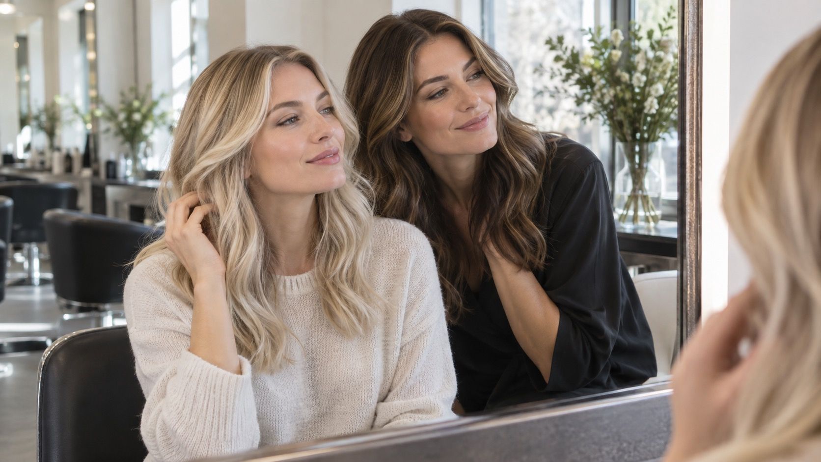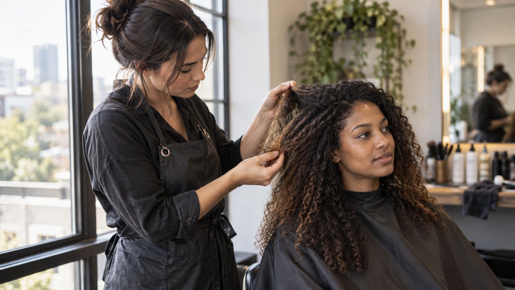
A hair color simulator can save you from choosing a shade that feels wrong before you ever sit in a salon chair, but it is better at showing direction than predicting an outcome. It changes a photograph, not the uneven history, texture, and light-catching behavior of real hair. Used honestly, a preview narrows a decision; treated as a promise, it can create a very specific disappointment.
A simulator changes pixels, not the history written into your hair
Open a virtual hair color try on tool with a clear front-facing photo and it may make a dark brunette look copper or a blonde look ash in seconds. That is useful because it answers a visual question: does this color family make my eyes, brows, and skin feel more balanced? The tool does not know whether the lower half of your hair was lightened last year, whether you use a tinted conditioner, or whether the crown is naturally darker than the nape. Those details matter once color meets actual hair.
Think of the preview as a paper fitting room. It can show that a cool, smoky tone may feel more natural than a bright gold one, or that a red family makes your face look more animated. It cannot tell you how much change is realistic in one appointment, how the existing color will shift, or whether the result will have the same smoothness as a studio image. The closer the requested change is to your current shade, the more useful the simulation tends to be.
Use a recent photo with daylight across the face, no beauty filter, and hair worn down. A dim restaurant photo is a poor test because the tool may mistake shadow for dark pigment. A sun-drenched holiday photo can do the opposite and make every proposed blonde look lighter than it will in a hallway mirror. Save two previews if you can: one close to your natural color and one a little beyond it. That gives you a sensible option and a boundary to discuss.
Previously colored lengths are where a neat preview becomes unreliable
Hair does not always behave as one fabric. A person can have natural regrowth at the scalp, older permanent color through the middle, and bleached ends that have faded after several washes. On screen, all of that may become one even chestnut, blonde, or red. In life, the sections can reflect the same color differently. The old highlighted ends may look brighter or more porous; the darker middle may hold onto its existing depth.
This is why a reference photo should include your current hair, not only the simulator result. Take it in daylight with the roots, mid-lengths, and ends all visible. A colorist can see where the story changes. If your ends are much lighter, a dark preview may still be useful as a mood board, but it is not evidence that every inch will look equally deep at the end of a service.
Toner is another quiet variable. A preview can suggest a clean beige or cool blonde, while the real shade can evolve as toning products fade and underlying warmth becomes more visible. That is normal color behavior, not necessarily a failed appointment. Ask what the intended shade should look like immediately after the service and what kind of shift is expected over the next few weeks. Avoid expecting an exact RGB value from an image; hair is reflective, moving, and never viewed under one fixed light.
| What the preview can help with | What it cannot confirm | Useful real-world check |
|---|---|---|
| Warm versus cool direction | How old color will respond | Show your roots, mid-lengths, and ends in daylight |
| Overall depth near the face | Exact level of lift or evenness | Compare with your natural regrowth and brows |
| Whether a shade clashes with skin tone | How it will look in every lighting condition | View the photo on a neutral screen and near a window |
| Possible placement around the face | Gray coverage or future root regrowth | Discuss the parting and maintenance interval in person |
Pay attention to the places a digital preview usually smooths away
Most simulators work hardest around the outline of the hair and the front sections, because that is what the camera sees. The underside at the nape, the hair behind the ears, and the parting often receive a broad layer of color rather than a realistic pattern. This matters if you wear a ponytail, tuck one side behind an ear, or part your hair differently from the photo. A shade that looks seamless in a straight-on image can reveal much darker or lighter sections in motion.
Texture also changes the reading of color. Curly and coily hair has highlights and shadows built into its shape; coarse strands can reflect light differently from fine ones; a smooth blowout can make a color look more uniform than it does after air drying. The best virtual hair color try on result is therefore not the most dramatic screenshot. It is the one that still looks plausible when you imagine your usual texture, your usual part, and the time you spend styling on a weekday morning.
Gray coverage is another area that needs a real conversation. A preview can paint the visible hairline evenly but cannot assess where gray is concentrated, how resistant it is, or how the transition will look as roots return. If coverage is important, include a close, unfiltered picture of the parting in your consultation notes rather than relying on a filtered app image.
Use the tool to choose a direction, not to demand an exact promise
A simulator is most valuable when you make it answer a limited question. Instead of asking, “Will this exact shade work?” ask, “Do I prefer softer beige over bright gold?” or “Does more depth at the root make my face look clearer?” Those questions produce decisions a professional can actually translate into placement, tone, and depth. They also leave room for your hair history to influence the final plan.
Make three screenshots: your current-looking version, a modest change, and the boldest version you genuinely like. Look at them after a few hours, not only at the instant the change appears. The first reaction is often driven by novelty. When you come back later, you may notice that the bold version makes your brows disappear, or that the subtle one looks more expensive because it keeps believable dimension.
Do not judge on one device alone. A bright phone screen can make ash tones look bluer and warm shades look more saturated than they appear on a laptop. If possible, view the result beside a window and lower the screen brightness slightly. The goal is not forensic accuracy; it is to avoid being led by a screen that is brighter, cooler, or more contrasty than your daily surroundings.
Bring better questions to the color consultation
Bring the simulator image, but label it mentally as a direction. Say which part you like: the darker root, the face-framing brightness, the muted warmth, or the overall depth. A single screenshot without that explanation can send the conversation toward the wrong detail. Two people can like the same image for opposite reasons.
Ask how your natural root and previously colored areas may affect the result, whether the preview's lightness is realistic for your starting point, and what the color could look like as it grows out. If your hair is textured, ask to see examples in a similar texture rather than only glassy waves. If gray coverage is part of the decision, ask how the hairline and parting will be approached, and what upkeep will look like between visits.
There is no need to arrive with technical chemistry language or a rigid formula. The practical evidence is enough: current daylight photos, a few simulator options, and an honest note about what you can maintain. A hair color simulator earns its place when it helps you say, “I want this feeling, but I want it to still look believable on my hair.” That is a much stronger starting point than asking a digital preview to predict every strand.