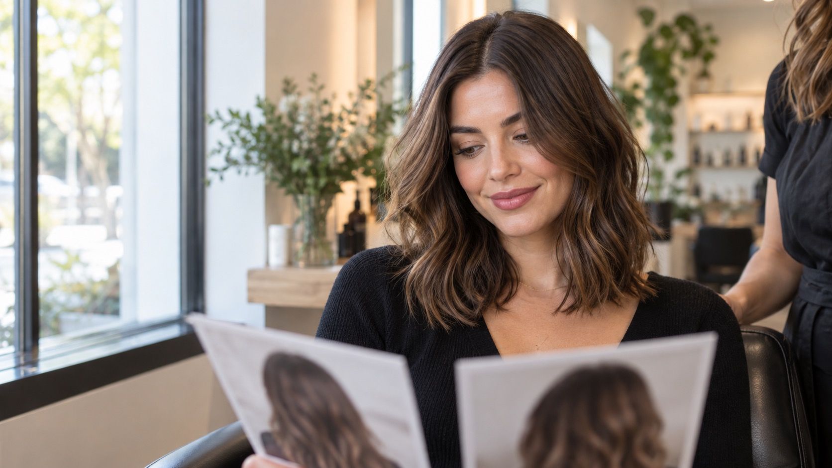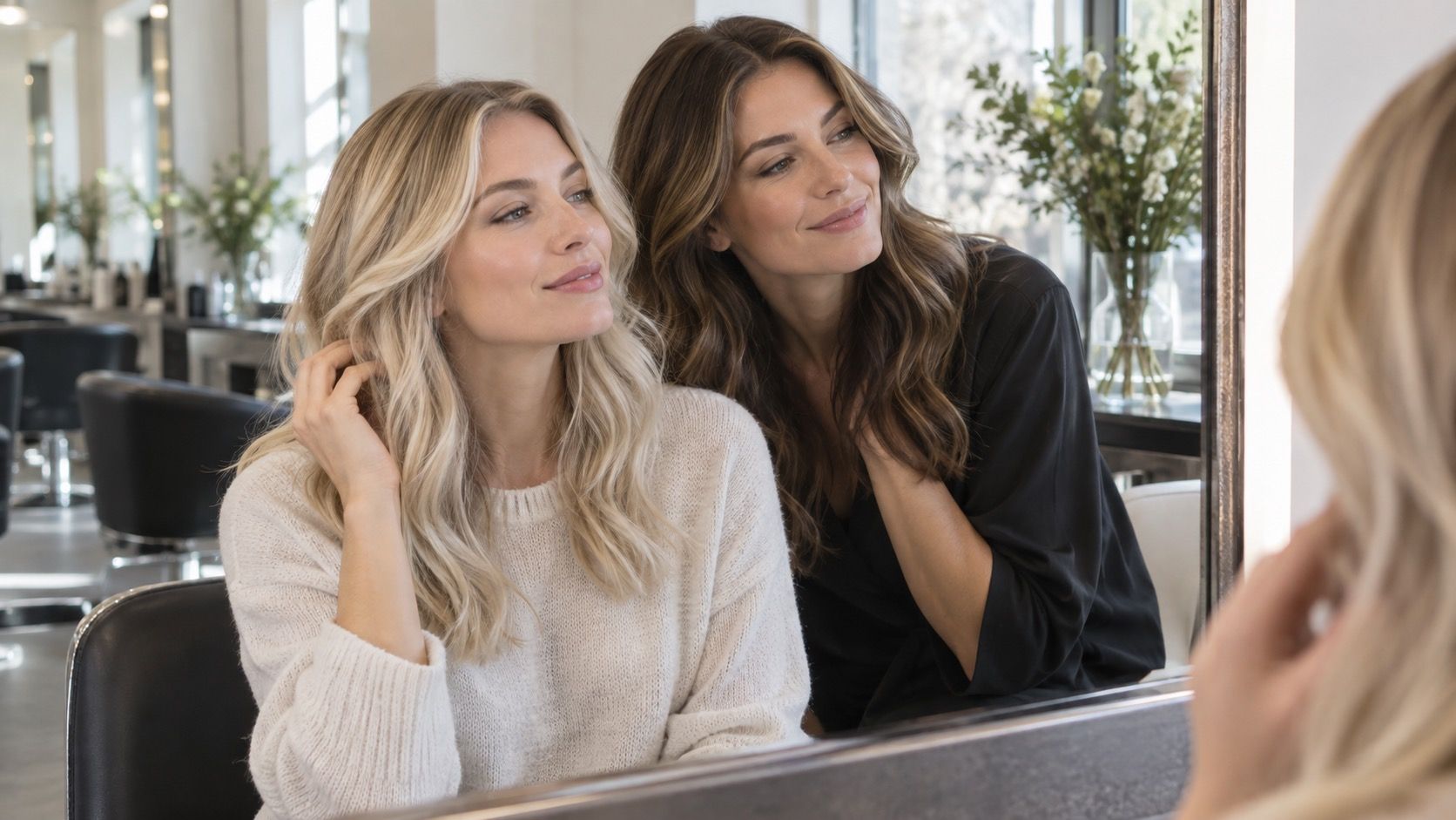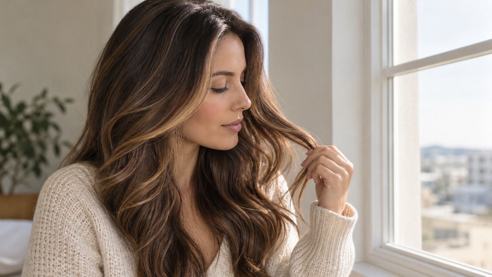
Trying on brunette hair color before committing is a sensible way to separate the brown you admire in an image from the brown that will work beside your skin, brows, and usual clothes. Brown can look simple until a digital preview puts espresso, mushroom, chocolate, and caramel next to one another. I would use that moment to make a narrow decision about temperature and depth, rather than asking an app to predict the exact gloss you will see after a salon visit.
Decide whether the brown needs to feel cool, neutral, or warm
Brown is not one shade. Espresso brown can carry a smoky, almost black coolness; mushroom brown sits quieter, with taupe or gray-beige notes; chocolate brown may be neutral or warm depending on the red and gold reflected in it. Caramel ribbons are another decision entirely: they change the way brown catches light rather than merely changing the base. A hair color try on works best when you compare these temperatures at the same depth first.
Use a photo in clean daylight and avoid a bright orange wall, a yellow bathroom bulb, or a strong beauty filter. Then test one cool brown, one neutral brown, and one warm brown close to your current darkness. Cool brown may make redness look calmer but can also bring out blue or gray under-eye tones. Warm chocolate can make pale skin look lively, yet a too-golden preview may make the complexion seem flushed. Neutral brown is often the useful control: it shows whether you actually need warmth or are just responding to extra shine in the image.
There is no universal rule that says a certain undertone must wear only cool or only warm brunette. Hair color analysis is more useful when it asks what happens to the face. Does the shade make the eyes stand out without making the skin look sallow? Do your brows still look connected to the hair? Does the color compete with the natural pink, olive, or golden cast in your complexion? Save the screenshots that answer those questions, not just the one that looks most different.
Test depth before you add caramel or red warmth
People often blame warmth when the real issue is depth. A medium chocolate brown can look rich and balanced, while the same warm direction at espresso depth can make the hairline dominate the face. Build a simple virtual set: natural depth, one shade darker, and two shades darker, all in a restrained neutral brown. Look at the images in thumbnail size as well as full-screen. The right depth should keep the eyes and cheekbones visible before the hair becomes the first thing you notice.
Very dark brown is particularly easy to romanticize in an edited photo. The app may add a reflective surface that hides how much contrast near-black hair creates at the temples and parting. Cover the shiny length with your hand and inspect the root area. If it makes light brows disappear or emphasizes the outline of the face too sharply, try a deep brown with a little softness rather than true espresso. A gloss can add the polished look later; depth is the harder commitment.
| Brown direction | What to inspect in the preview | When it is usually the safer first test |
|---|---|---|
| Mushroom brown | Whether the taupe cast makes skin look muted | When you want a cool-neutral change without inky contrast |
| Neutral chocolate brown | Whether the face looks clearer in regular daylight | When you are unsure whether cool or warm suits you better |
| Warm chocolate brown | Whether gold and red reflect warmth or make redness stronger | When the natural base already has soft warmth and you like it |
| Espresso brown | Whether brows, lashes, and root line still look balanced | When your natural contrast is already medium to high |
| Caramel ribbons | Whether the lighter pieces look blended rather than striped | When you want movement without changing the whole base |
Parting changes this test. A middle part exposes the root and frames both sides of the face evenly, while a side part can hide a darker base under one sweep of hair. If you switch between them, make a preview for each. A medium brown that looks quiet with a deep side part can appear much more solid with the center part you wear to work. That is not a reason to avoid it; it is a reason to choose deliberately.
Use cool brown carefully when your hair has warmth underneath
Cool brunette does not automatically mean gray. Mushroom brown and soft ash brown can be lovely when they retain a little beige depth, especially on a natural dark blonde or medium brown base. The risk comes when a preview pushes all warmth out of the image. Hair can look modern on screen but flat in a cloudy window reflection, particularly if the ends are dry or porous. Compare a true cool brown with a cool-neutral version before deciding that the smokiest option is the most refined.
Maintenance is another practical check. Lightened lengths tend to reveal warmth as a cool gloss fades. A virtual try-on cannot show that fade pattern, but it can help you decide whether the starting direction is worth maintaining. If you love only the coolest screenshot and dislike every slightly softened version, you may be choosing a look that will feel wrong between gloss appointments. If mushroom brown still looks good with a touch more beige, it is likely to be more forgiving in ordinary life.
Bring attention to the ends in your original photo. If they are already lighter than the root, placing a dense ash-brown overlay on the whole head may create uneven, overly dark-looking tips as color grabs porous areas. That is a consultation issue rather than a formula to solve online. The preview is still useful because it lets you say, clearly, that you want a muted brown direction without the almost-black effect of a solid cool shade.
Compare neutral brown and warm brown in the light you actually use
Neutral brown is often dismissed as the safe choice, but it can be the most useful bridge between a current color and a bigger change. It has enough softness to avoid the sharpness of ash and enough depth to avoid obvious gold. In a hair colour try on, neutral chocolate or beige-brown is especially worth testing if your favorite online pictures alternate between cool brunette and caramel brunette. You may not need to pick a side as dramatically as the photos suggest.
Warm brown has several versions. A quiet chocolate brown can look like healthy depth; a copper-brown or golden caramel can read much warmer and more noticeable. Test the base separately from the ribbons. If full warm chocolate makes the face look ruddy but subtle caramel pieces make it look brighter, preserve a neutral or cool-neutral base and use warmth only through selected lengths. That combination often gives movement without turning the overall impression orange in indoor lighting.
Check a screenshot beside the colors you wear most: black, white, navy, cream, olive, pink, or denim. It is a humble test, but it catches an issue that a close-up selfie misses. Some warm browns look excellent against cream and strangely yellow next to a crisp white shirt. Some cool browns look sharp with navy and severe with a soft beige sweater. The right choice does not need to flatter every garment; it should make sense with the colors that show up in your ordinary week.
Do not confuse a glossy finish with a new hair color
Many online previews brighten the length and add smooth, reflective bands. The effect can make a familiar brunette shade look newly expensive even though the apparent change is mostly shine. To separate the two, look at the color in the darker panels behind the ears and around the nape. If those areas remain close to your current hair and you still like the image, a gloss or a small tonal adjustment may be enough. If you only like the simulated bright streaks, ask yourself whether you are actually craving dimension rather than a darker base.
Caramel ribbons are a good example. On wavy hair they may appear as soft, sunlit movement; on straight hair they can look broader and more deliberate. Preview them with your normal texture, not only a borrowed image with salon waves. Fine ribbons around the face are easier to grow out and easier to soften if they feel too warm. Broad, high-contrast pieces create a more visible change and need a more intentional blending plan at the root.
A simple test is to compare three versions: your natural brown with extra shine, neutral brown with the same shine, and neutral brown with a few lighter ribbons. If the first and second look nearly identical, do not color merely to chase the app finish. If the third makes the features look brighter while the base still feels like you, you have identified a practical request: subtle dimension, not a total brunette reinvention.
Turn your preview into a clear salon conversation
Save no more than three or four images. One can show your preferred temperature, one the preferred depth, and one the amount of contrast you can live with at the root. More screenshots tend to create a collage of conflicting goals: cool espresso in one, warm caramel in another, pale highlights in a third. A colorist can translate a focused description much more easily than a board where every image has a different base.
Tell them what has been on your hair, including permanent dye, box color, black glosses, highlights, or a recent toner. That history determines how predictably a brown can be shifted and how it may fade, while a virtual try-on only helps establish the visual target. Also mention the maintenance you actually want. A soft neutral brown that fades gently is a different plan from a high-shine espresso that needs regular glossing to stay rich.
The useful outcome is not an app result copied pixel for pixel. It is a decision you can state in plain language: medium-depth neutral chocolate rather than nearly black espresso, or a cool mushroom base with restrained caramel around the face. Once you know that, you can evaluate the finished color in daylight and make the next adjustment from a clear starting point instead of guessing whether the brown became too dark, too warm, or simply too shiny in the salon mirror.